Branding, Color Psychology, Printing
Brand Consistency Through Color Management

The most successful companies understand that an easily identifiable brand is their superpower. It’s what sets them apart from their competition. Color consistency is crucial to brand identification and your brand should be unchanging no matter where and how you use it. Colors can change drastically when printed on different materials or viewed in different formats. Consistency is achieved through color management. This article will define color management, outline the color management process and explain its role in a company’s branding strategy.

What is Color Management?
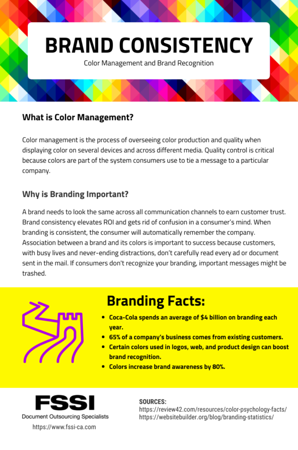
Color management is the process of overseeing color production and quality when displaying color on several devices and across different media. Quality control is critical because colors are part of the system consumers use to tie a message to a particular company. Colors can look different on-screen versus print; therefore, you must avoid picking a color on a computer display. Monitors use RGD (red, green, blue) that appear much brighter than on paper. Print uses a process called CMYK (cyan, magenta, yellow, black) that is more muted. View the image below, from Business 2 Community, to see how the same colors can look different on a screen versus print.

The same exact color can look very different when viewed in print or on a screen.
How Does Color Management Work?
When companies partner with color specialists for color management, they usually bring in a single visual target. The target is typically a printed version of the company’s logo that is used as a guide for matching all subsequent print jobs. The color specialists then use a light booth to correctly view the colors that need to be matched. A light booth lets specialists view color differences without being impacted by light variations. They also use tint books to help match project needs with color samples from Pantone’s Matching System (PMS). PMS is a color reproduction system that assigns numbers to color variations to properly organize them for easy use.
How Does Color Management Affect Brand Recognition?
A brand needs to look the same across all communication channels to earn customer trust. Brand consistency elevates ROI and gets rid of confusion in a consumer’s mind. When branding is consistent, the consumer will automatically remember the company. Association between a brand and its colors is important to success because customers, with busy lives and never-ending distractions, don’t carefully read every ad or document sent in the mail. If consumers don’t recognize your branding, important messages might be trashed.

Examples of Brand Recognition Tied to Color
An example of a notable brand with great logo recognition is Starbucks. As soon as you hear that name, you can picture the forest green logo with the nautical character. Whether that forest green color is on a cup of coffee, store window or even a billboard, you know the brand behind the logo. If the logo was printed in lime green, for instance, customers wouldn’t trust that it was the same brand.
Visually, the consumer shouldn’t see a difference whether the logo appears on a cup, the sign outside the building, or even an advertisement on the Internet. Uniform branding provides Starbucks with instant brand recognition and the credibility that goes with that identification. Consumers buy from brands they know and trust. Customers will purchase that cup of joe anywhere in the world because they’re familiar with it. No matter where a consumer travels, they know the famous two-tailed mermaid. They know exactly what to expect – there is no brand confusion.
What is Brand Uncertainty?
Brand uncertainty happens because your brand is not consistent and is not set in the consumer’s mind. Many companies fall into the brand confusion trap because they do not use the same colors throughout their entire branding process. They may use one color on promotional products, another in print ads, and another in online advertising. You can eliminate this problem through strict color management practices. Read on to learn about a branding blunder from the past that we can still learn from today:
Example of a Branding Blunder – GAP is an international clothing brand that changed its iconic logo, which was recognizable to every loyal customer. The new logo that was introduced in 2010 included only the name with a tiny blue box on the last letter. Even if you don’t shop at GAP, you can picture the white letters inside the royal blue box. The logo change caused outrage among customers and six days later, the company went back to its old logo design. GAP was on the verge of losing its brand identity. Don’t make the same mistake.
Partner with Color Management Experts
Color management can be a daunting process for companies without proper experience. Partnering with a company that specializes in coloring matching is optimal for your company’s branding success. Trying to achieve the same results without a trained eye can be time-consuming and costly if mistakes are made. The following quote from a color specialist explains it all:
“We had a client who tried using color management software to find the closest color match to their current logo. Unfortunately, the closest PMS color match by machine was visually too different from the logo and the clients were not happy with the choice. I had to go back and use the PMS color that looked best to my eyes. The client loved my choice and FSSI has been in charge of their color management ever since.” – FSSI Color Specialist.
FSSI
FSSI is a print and mail outsourcing service provider specializing in high-volume customer communications. Color matching specialists at FSSI work closely with clients to color manage their print jobs on surfaces that produce greater value for the price point. After colors are matched, we calibrate each job individually on our printing devices. This ensures we produce the same printed color over a variety of different surfaces. Once device profiles are set, they never have to be changed again, allowing a company to maintain brand consistency on all future prints.
To learn more about the color management process or how we can help enhance your branding consistency, schedule a demo today or call 714.436.3300 to speak to an outsourcing specialist.

Sources:
https://www.business2community.com/marketing/keeping-color-consistent-across-print-digital-01933585


