Color Psychology, Customer Experience and Engagement, How-to Guides, Marketing Strategies
Call-to-Action Examples and Best Practices that Convert

Design Your Marketing Call-to-Action for Maximum Conversion
There are a variety of strategies and business tactics for achieving maximum conversion rates on your web pages, landing pages and emails. To get your service or product into the right hands, you need to develop an easy and eye-catching reference to draw in your readers and audience: the call-to-action (CTA) button. It’s a form of commitment that generates intrigue with the most important and beneficial details of your offer – helping to encourage any reader to the next step of the purchase or conversion process. It’s another form of engagement that helps turn a curious reader into an interested buyer.
Integrating a “Subscribe” or “Join” form of call-to-action can be the driving factor to finding the right users. By helping them on to the next step of your process, you encourage them to move on to the next step of becoming your customer.
The more effective and eye-catching your CTA button is, in whatever form it takes, the more you’ll actively engage with your desired audience. Informative copy apprises them about the endless possibilities of your service or product while your call-to-action button encourages them to become a new or repeat customer or to learn more about your offerings. In an increasingly crowded market of remarkable services, a unique and effective approach can be an integral factor in your success.
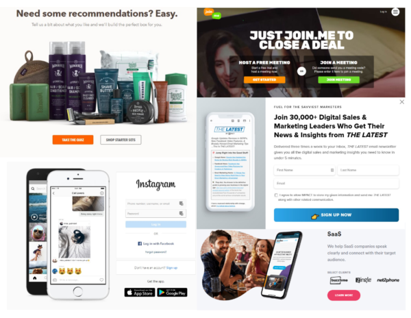
Here are a few call-to-action button examples. CTA buttons come in all shapes, sizes and colors. Choosing the right style for the right objective is key to an effective CTA.
How to Create an Effective, Eye-Catching CTA Button
Great Design Catches Eyes and Customers
Creating a unique and attention-grabbing call-to-action button starts with appearance. Engaging with your customers is key, but so is catching their eye with a well-designed CTA that invites them to take the next step. Choose a clear and distinct button that stands out from the rest of your landing page, webpage or email. The design should be on-brand and welcoming, helping to cultivate an inviting environment for any curious consumers. It should appear distinct from the rest of your page and draw in your customer with the next step of the buying or learning process.
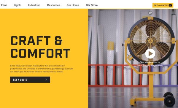
This example includes a simple and effective call-to-action, with a prominent “Get a Quote” button that stands out with its color and wording next to an embedded video that reinforces the product benefits.
Your Button Color Matters
Memorable and striking colors are key in having a clear CTA button that delivers the necessary information or offer. Utilizing every possible asset can help draw the eye, and science has proven that certain colors elicit a wide range of reactions from your customers. Color theory is an incredibly intriguing study of the emotions that certain colors can evoke from the human psyche. For example, red incites excitement and urgency, green has a calming effect, and orange or yellow bring warmth and happiness. When coupled with a contrasting background and well-written copy, a perfectly-colored CTA button will intrigue any curious mind.
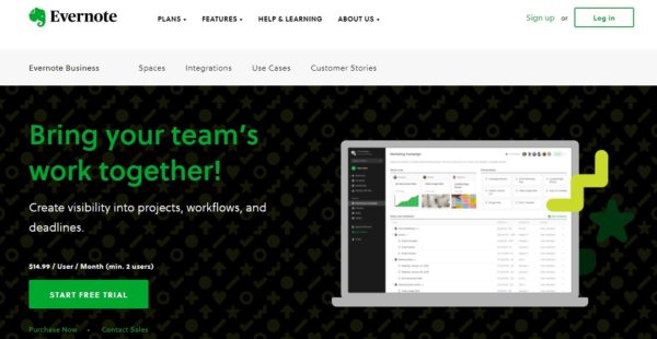
Evernote uses the color “green” to help the button and copy stand out against the dark black background. This draws your eye to the next step.
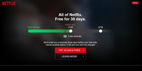
Netflix adds a visual reminder of the length of the free trial and lets you know when to expect an email reminder as to when regular billing will begin. The “red” and “green” text pops out against the black background.
Choose the Perfect Button Shape and Size
Keeping the correct sizes and proportions for your page is just as important as choosing the right colors and design. Your CTA button should perfectly fit with your imagery and copy, not diverting attention from the necessary information, but instead serving as a complementary asset on your page. It’s also important to optimize the size of your CTA button for both desktop and mobile, as your customers will view your information and offers on different-sized devices.
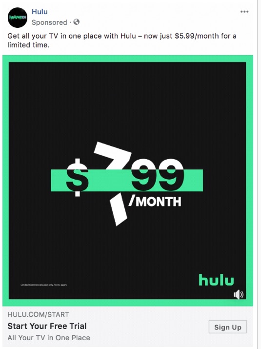
A small button works best on mobile devices with limited visual real estate. In this Hulu ad, the offer is visually presented with the new $5.99/month offer. The “Sign Up” button is small on the bottom right.
Testing Leads to Optimization
Your call-to-action plays a big role in the success of your on-page marketing efforts. That is why testing is key to understanding what will resonate best with your customers and discovering the most effective strategies to succeed. Drawing in new customers and maintaining your current base isn’t just a matter of creative design; it’s a matter of testing to see what works best. By A/B testing different colors, sizes and content, you will learn the right combination to generate those leads and make sales.
Calling Your Customers to Action
An effective call-to-action button is an invaluable asset to any marketing campaign. More than simply “Buy it Now” or an invitation to join a newsletter, it is a key factor in driving your customers to the next step of your buying process. It should stand out from the rest of your page, educate your reader about your capabilities and create the necessary amount of curiosity or desire for your service or product. Don’t rely on outdated techniques that don’t deliver – use a few simple and effective steps that can lead to a completely new audience.
Create a captivating design by utilizing complementary yet contrasting colors that remain on-brand, but produce a distinct and memorable look for your page. Draw attention to your call-to-action with a design that encourages your reader to commit to or engage with what comes next. Determine the most effective system by trying multiple options, letting literal success and data be deciding factors in your final design choice. Using these simple but effective tips for a captivating call-to-action button may be the final factor in turning curiosity into a consumer.
Create Your Effective CTA Today!
Need assistance with creating your optimum call-to-action? FSSI’s integrated marketing services are the starting point for your customer communications. Call 714.436.3300 today to learn how to maximize the on-page experience with design best practices tailored for the greatest impact.
