


Branding, Color Psychology, Marketing Strategies
The Marketing Effects of Pantone’s Color of The Year
![]() on June 12, 2020
on June 12, 2020

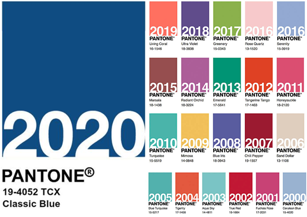
Pantone Color of the Year 2020
Pantone LLC was founded in 1962 but didn’t become a household name until debuting its famous superlative in 2000, “Pantone Color of the Year.” According to Leatrice Eiseman, the executive director of the Pantone Color Institute, common reactions to the company’s name included, “You mean the shampoo?” Others wondered if it was a loaf of Italian bread. Regardless, Pantone became a powerful brand and a creative leader for graphic designers, advertisers and marketers.
Since its inception, “Color of the Year” has immensely influenced visual culture across industries and around the world. From fashion and beauty buyers to product and interior designers and manufacturers, it seems nearly every industry takes note of the color forecast from the world’s most influential color system. Take a look at the history of Pantone, learn about Pantone’s Color of the Year 2020 and see how it might benefit your marketing strategy.
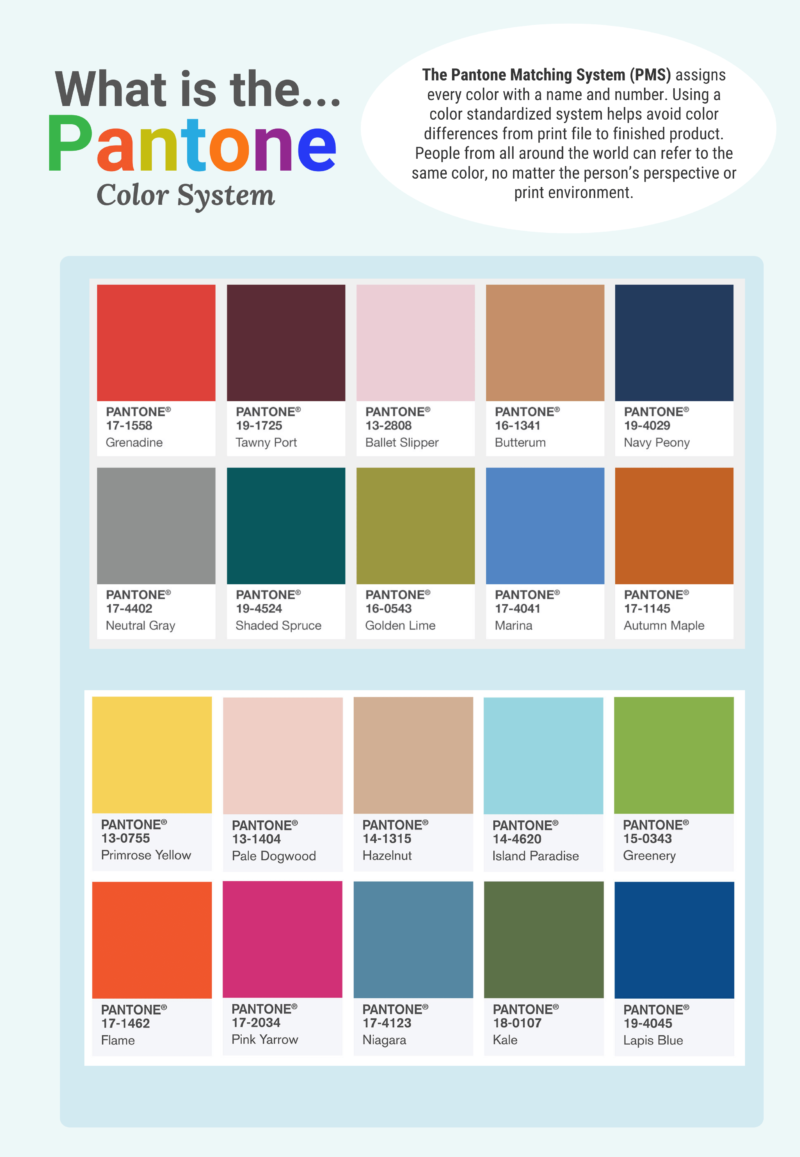
What is the Pantone Matching System (PMS)?
Pantone revolutionized the printing industry by creating its Pantone Matching System (PMS). PMS is a patented numbering system assigned to chips of color and designed to provide consistent and accurate color in production, regardless of the printing equipment being used, anywhere in the world.
History of the Pantone Color of the Year
Pantone has annually forecasted a “Color of the Year” based on certain metrics, marketing trends and psychological attributes since 2000. Designers from all industries take note and inspiration from the famous superlative and color palette each year.
Pantone has developed an incredible reputation for its expertise in color. The company has used its patented color matching system in many businesses and industries, helping to influence design choices across a diverse marketing landscape. Partnerships with Lowes, Sephora and JCPenney help to demonstrate just how prominently displayed Pantone’s yearly selection is with immediate product lines and services branching from the Color of the Year choice.
Lowes will create numerous lines for interior designers, home decorators and more that prominently feature the color choice; Sephora will release several make-up products using the color. Companies like Audio UX and Firmenich have helped to develop the selection into a sound and a taste. FedEx has created numerous outlets for Pantone’s color choice that include banners, business cards and graphics. Adobe has even released photography and graphic assets in its own Pantone Color of the Year category.
What is The Pantone Color of the Year for 2020?
Earlier this year, the Pantone Color Institute announced that its 2020 Color of the Year is PANTONE 19-4052 Classic Blue. Conveying confidence and reassurance, Classic Blue is calming and soothing, resembling the night sky at dusk – anticipating what will happen next. The choice comes at a time of uncertainty and nervous excitement, not knowing what the new decade will bring. (Similarly, the 1999 Color of the Year was Cerulean Blue. Remember Y2K?)
Already recognizable around the globe, the “universal favorite” Classic Blue has already found its way into many facets of modern culture and life, including clothing, furniture and even wallpaper!
Next, let’s examine what effect Color of the Year plays into marketing trends. More importantly, let’s dive into how to implement Pantone’s Color of the Year into your marketing strategy.
How Will the Choice Affect Marketing Trends?
The beauty of Pantone’s color choice is that marketing trends have already played a part in choosing Classic Blue – a reassuring color that provides confidence and a connection in uncertain times. Playing on the psychology of color, Classic Blue elicits positive thoughts and emotions, an important trait that benefits campaigns, websites or direct mailers (something that savvy marketers and advertisers already know!). Its impact is significant – 43% of people associate blue with reliability, 34% with trust and 28% with security.
As we stand at the beginning of a new decade, this color choice leads the way to influence consumer behavior with its calm and peaceful qualities.
How Can Classic Blue Benefit Your Marketing?
In tumultuous and conflict-filled times, Classic Blue helps to convey a soothing sense of calm – a restful color that brings a sense of peace and tranquility. Your company should remain a steady beacon amidst any uncertainty. That doesn’t mean that every asset or mailer should be altered to feature different shades of blue, but that subtle and precise uses of Pantone’s color expertise can enhance any customer communication – and in this case, send an underlying message of reassurance. Plus, you’ll show that you’re on-trend. Create an updated social media cover, blog graphic or icon – Classic Blue is where it’s at in 2020.
To implement Pantone’s Color of the Year into your customer communications or learn more about FSSI’s precise color match expertise, request a complimentary demo today or contact an FSSI Color Specialist at 714.436.3300.
Sources:
https://www.architecturaldigest.com/story/pantone-color-of-the-year-2020